

Hundreds of spam emails. Down to zero.
A wedding band’s contact form was bringing in more junk than business. The brief was a redesign and a spam problem. The real problem was that nobody could tell a buyer from a bot.
More junk than business.
Nobody could tell a buyer from a bot until a person had read every message.
An open enquiry box invited anyoneAnd it mostly attracted bots.
Real enquiries waitedThey sat unanswered while someone sorted through the noise.
Every sales call started coldNo budget, no date, no venue, no guest count.
No way to see patternsEach enquiry lived and died in an inbox.
Fewer emails. Better ones.
A lead qualification system.
An analytics dashboard the client controls.
A full redesign to the new brand.
A form that earns the answer.
A long form isn’t a cost if every question clearly helps the person answering it. Progress and time left show on every step, every question has a way out, and nothing is asked without a reason the couple can see. That’s why nine steps beat a one-field box.
- One question per screen, no wall of fields
- Progress bar and time estimate on every step
- Large tap targets, almost no typing
- A way out on every question that could stall a lead
- Review before sending, to keep the data clean
Try it. A shortened version: three of the nine questions and the review screen, translated from Italian.
The inbox became a dataset.
Every completed flow writes into a GDPR-compliant dashboard the client controls. Compliance was a build rule here, not a feature to advertise.
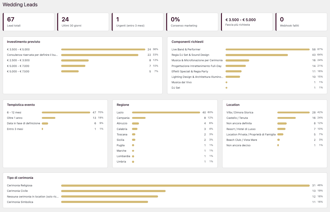
What the tiles at the top answer, at a glance
Every screen, side by side.
The form screens are from the live Italian site. Drag through them, or open one full size.
Calls that start informed.
Spam down to zero
Every enquiry that arrives is qualified
Real personas, built from real data
A redesign true to the new brand
The structure filters out anyone unwilling to engage. The client now sees prospects as a whole: recurring needs, common budget bands, and who is actually booking.
An inbox.
A dataset.
What went into it.
 Built in collaboration with Then. I led design and user experience as part of the Then production team.
Fewer enquiries. Better ones.
Tell me what your inbox looks like today. A free call, about 30 minutes, no pitch.